
In the world of customer projects, a regular task I often face is diving into an organisation's file system to understand its setup. This usually involves looking into permissions structure and figuring out how ready it is for moving to the cloud.
Migrating data to SharePoint Online might seem easy, especially with many free and paid online tools. But the actual task is making a structure that's easy for users. You want to ensure people can work together quickly, but you also need to keep things safe and well-managed. It's like a juggling act.
In this post, I'll discuss how I've tried to show file structures using graphs. We'll look at tools like TreeSize for getting the data and Gephi for making the visuals. Join me as we explore this further!
This article contains many large images due to the nature of what we will be discussing.
What I want to achieve
There are two main pieces to what I'm discussing. First, a complexity score can be created using a TreeSize SQLite database. Applying an algorithm with specific parameters allows me to develop a score that tells us how complex a file structure might be. I will touch on this in another blog most likely!
The second piece, this blog post's main topic, is visual representation. I want to show either the whole or a section of a file structure in a way that highlights certain features. Looking at raw data or basic bar charts only sometimes gives the complete picture.
Understanding something often becomes simpler when I can see the bigger picture and dig into its details. This way, I can spot things I might have missed otherwise.
Side note: I won't be explaining the concept of graphs in the blog, but please feel free to use this as a baseline because I found it very useful to explain it.

Inspiration
Before diving deep into the technicalities, let's take a moment to understand the spark that ignited this idea and the potential value it can bring. My inspiration traces back to the renowned information designer Hanna Piotrowska.
She has an impressive collection of books dedicated to the art of presenting data in ways that are both accessible and aesthetically engaging. While exploring her work, I came across her unique approach to portraying intricate data relationships.
Despite data often having multifaceted connections and many intriguing sub-categories, presenting it comprehensibly can take time and effort. However, Piotrowska has a knack for simplifying this complexity, and her work inspired me to venture into this realm.
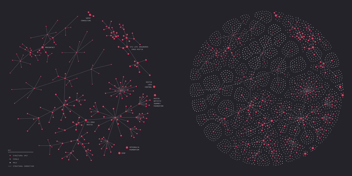
What captivates me about such visuals is their transformative power. They can weave a narrative out of a dataset that, to some, might appear mundane. I yearned to bring a similar vibrancy to visualising a file structure.
Picture this: each dot symbolises a file or a folder, with varied hues indicating their significance. Add a web of lines, intricately mapping out the backbone of the core folders and structures. I aim to bring this fusion of art and data to life.
This post is for members only
Create a free account to read this post and get access to all members-only content.
Sign up freeAlready have an account? Sign in